Analytics Dashboard for Remote Employee Management
Compare analytics dashboards for remote teams: timezone-aware metrics, privacy-safe visibility, and HRIS integrations managers actually use.


A manager running a distributed team across four time zones has no hallway, no glance across a desk, and no shared clock. What replaces that is a small set of numbers pulled from the tools the team already uses: project boards, time entries, HRIS records, and communication platforms.
Assembled well, those numbers show delivery pace, workload balance, and early burnout signals. Assembled badly, they show keystrokes and screenshots, and the team learns to game them within a week.
An analytics dashboard for remote employee management earns its place when it answers three questions clearly: what shipped, who is overloaded, and where work is stuck waiting on someone. Anything past that, especially minute-by-minute activity capture, adds cost and erodes trust faster than it adds operational efficiency.
The distinction matters commercially too. Time-and-project platforms, productivity analytics tools, and security-led insider-risk systems all market themselves to remote workforce buyers, and they collect very different data at very different price points.
Picking the wrong category means paying for surveillance depth a distributed team never needed, or discovering six weeks in that the tool cannot allocate hours to clients for invoicing.
An analytics dashboard for remote employee management earns its place when it answers three questions clearly: what shipped, who is overloaded, and where work is stuck waiting on someone. Anything past that, especially minute-by-minute activity capture, adds cost and erodes trust faster than it adds operational efficiency.
The distinction matters commercially too. Time-and-project platforms, productivity analytics tools, and security-led insider-risk systems all market themselves to remote workforce buyers, and they collect very different data at very different price points.
Picking the wrong category means paying for surveillance depth a distributed team never needed, or discovering six weeks in that the tool cannot allocate hours to clients for invoicing.
Key Takeaways
- Track delivery outcomes, capacity, and async responsiveness; treat activity levels as context, never as a performance score.
- Normalize for time zones, roles, and part-time schedules before comparing any two employees on a dashboard.
- Match the software category (time tracking, productivity analytics, or insider-risk monitoring) to the decision you need to make, then check what it captures by default.
What Should a Remote Management Dashboard Actually Measure?
Four data families cover nearly every decision a remote manager makes: delivery outcomes, time and availability, async collaboration flow, and well-being signals.
Project completion rate and cycle time answer whether work is landing; time and timesheet data answer whether capacity is being spent where the business intends; response and handoff times expose async friction; sentiment and turnover indicators flag risk that no productivity metric will surface in time.
Outcome Metrics That Show Delivery and Capacity
Project completion rate against committed scope, cycle time per work item, and rework volume form the core delivery view. These come from the project management system rather than the desktop agent, which makes them harder to fake and easier to defend in a performance conversation.
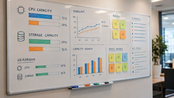
Capacity sits alongside delivery. Resource allocation views showing planned hours versus logged hours per person per project reveal the overload that shows up later as missed dates.
Hubstaff's remote analytics documentation notes a specific failure mode here: without data, managers do not notice someone consistently working late until retention issues soon follow.
Time, Attendance, and Availability Signals in Context
Time tracking software answers billing and staffing questions, not diligence questions. For agencies, billable hours versus non-billable hours per client is the single most valuable number on the dashboard, because it drives both invoicing accuracy and project scoping for the next contract.
Attendance in a remote context means published availability windows, not login timestamps. A dashboard showing each person's declared core hours in the viewer's local time prevents the common mistake of reading a 3 p.m. Slack silence as absence when the employee's day ended at noon Pacific.
Idle time and app usage belong in a diagnostic drill-down, not the headline view. They help answer "why did this task take 14 hours" when the assignee raises it, and they mislead badly when read as a productivity ranking.
Async Collaboration Metrics Without Treating Slack Activity as Performance
Average response time on blocking requests is worth tracking; message volume is not. A person who sends 200 Slack messages a day may be the bottleneck rather than the top contributor, and dashboards that count activity reward exactly that behavior.
Useful collaboration metrics measure flow between people:
- Handoff wait time: hours between a task moving to review and review starting
- Blocked-item age: how long tickets sit in a waiting state, by owner of the dependency
- Meeting load per person: hours in synchronous calls per week, which competes directly with focus time
- 1:1 cadence: whether each direct report had a manager conversation in the last two weeks
Those four hold up in review because each points at a fixable process, and none of them ask an employee to perform visibility.
Well-Being and Retention Signals That Merit a Human Follow-Up
Employee well-being indicators work as triggers for a conversation, and never as automated actions. After-hours work percentage, unused PTO balances, weekend logins, and declining engagement survey scores each justify a manager reaching out, and none justify a formal warning on their own.
Turnover risk modeling belongs to HR professionals with access to compensation, tenure, and internal mobility data, so it sits in the human capital view rather than the team manager view. Workforce analytics that mixes these layers into one screen tends to produce either paralysis for executives or overreach by frontline managers.
How to Design a Dashboard Managers Can Act On
A dashboard becomes actionable when every widget maps to a decision someone is authorized to make. That requires joining HRIS, time, project, and communication data on a reliable person identifier, normalizing for time zone and schedule, comparing people against role baselines, and cleaning the inputs before anyone builds a policy on top of them.
Combine HRIS, Time Tracking, Project, and Communication Data
The HRIS supplies the spine: employee ID, role, manager, location, employment type, and start date. Everything else joins to it, which means the email or SSO identifier has to match across systems before any data visualization work starts.
Practical build path for teams already in the Microsoft stack: extract with Power Query, model in Power BI, and keep raw exports untouched in a staging layer. Tableau and Excel both work for the same job, and Excel becomes painful above roughly 20 people because manual refreshes stop happening.
An HR analytics dashboard combines HRIS, payroll, time and attendance, and engagement data into one surface, and the same principle applies here with project data added. Purpose-built tools shortcut the integration work: Hubstaff connects to Slack, Trello, Asana, and QuickBooks so time data flows to payroll and project systems without a custom pipeline.
Make Time Zones, Roles, and Work Patterns Comparable
Store every timestamp in UTC and render it in the viewer's local zone, with the employee's zone labeled next to their name. Without that, an "overnight activity" chart flags half of an APAC team as working unusual hours.
Normalize hours to FTE before any comparison. A 0.6 FTE contractor logging 22 hours is at capacity; on a raw hours chart they look like an underperformer. Part-time schedules, compressed weeks, and regional holiday calendars all need to be attributes on the person record rather than exceptions someone remembers.
Use Role-Based Baselines Instead of Universal Productivity Scores
Composite productivity scores collapse under scrutiny because the weightings are arbitrary. A support agent handling 40 tickets and an engineer closing three tickets are both fully utilized, and a single productivity classification number cannot express that.
Set baselines per role from the team's own trailing data: median cycle time for a design task, median tickets per shift, median billable ratio for a senior consultant. Then flag deviation from that role's baseline, not deviation from the company average.
Activity tracking and activity monitoring metrics can inform the baseline, and they should never be the baseline.
Build Clear Views for Executives, Managers, and HR
Three audiences, three views, one dataset. Access control here is a privacy requirement: a team lead should see their team, an HR leader should see company-wide trends, and employees should see their own data, a separation that prevents privacy and data management problems from surfacing later.
| View | Primary question | Typical widgets | Granularity |
|---|---|---|---|
| Executive | Are we delivering and staffed correctly? | Completion rate by department, billable ratio, headcount vs. plan | Team and department, trend lines only |
| Manager | Who is blocked or overloaded? | Blocked-item age, planned vs. logged hours, 1:1 cadence | Individual, current sprint |
| HR | Where is retention risk building? | After-hours percentage, PTO usage, engagement scores, turnover trend | Cohort and department |
| Employee | How does my week look? | Own hours, own tasks, own focus time | Self only |
Trend lines beat pie charts for almost every metric here, because the useful signal is direction over eight weeks. Pie charts earn a place only for a genuine part-to-whole split, such as billable versus internal versus PTO hours.
Validate Data Quality Before Automating Decisions
Run the dashboard in read-only mode for one full month before it informs any performance or compensation decision. Check three failure sources: employees who forgot to start a timer, tasks closed in bulk at sprint end, and Asana projects where the team stopped updating statuses mid-quarter.
Audit trails on the dashboard itself matter for any remote employee monitoring deployment. Log who viewed which employee's data and when, publish that policy, and the visibility program survives its first difficult conversation with an employee or a works council.
Choosing Software by Visibility, Privacy, and Workflow Fit
Three distinct software categories serve remote employee management, and buying across them by accident is the most expensive mistake in this space. Time and project trackers price around billing accuracy, productivity analytics platforms price around coaching and process insight, and security-led monitoring platforms price around insider risk and data loss prevention.
Time and Project Tracking for Agencies and Client Work
Agencies and consultancies need hours attributed to clients and tasks with enough accuracy to invoice from. Hubstaff sits here, offering itemized timesheets in one click, manual time entry with notes, one-click approvals for payroll, and over 20 report types filterable by member, date range, and project, with Excel and PDF export.
DeskTime and Time Champ occupy similar territory with time and attendance emphasis. The buying test is straightforward: export a week of tracked time and see whether it produces an invoice line item without manual rework.
Productivity Analytics for Workload and Process Coaching
ActivTrak and Insightful target managers who want workload balance and process bottleneck data without a security posture. Insightful scores 4.7 stars across platforms, while ratings across this category vary widely, with SentryPC landing at 2.2 to 2.5 stars, so validating a shortlist against real reviews is worth the hour it takes.
Time Doctor converts device-level signals into time by app, idle time patterns, and workday summaries, with employee self-service submission. These platforms answer "where is the process losing time" and they overstate their ability to answer "is this person performing".
Security-Led Monitoring for Insider Risk and Compliance
Teramind and Veriato are user activity monitoring and behavioral analytics platforms built for insider risk, regulated industries, and DLP requirements. They capture far more than productivity tools do, including content-level activity, and they are the right answer when the driver is a compliance mandate or a demonstrated data exfiltration risk.
Deploying one of these for ordinary productivity visibility is where invasive surveillance complaints originate. The data security capability is real, and it comes with a legal and cultural obligation to disclose, scope, and retain narrowly.
When Screenshots, GPS Tracking, and Keystroke Logging Are Justified
Screenshot monitoring, GPS tracking, and keystroke logging are justified in narrow cases: field service teams with vehicle and site verification requirements, contractor arrangements where clients contractually require activity evidence, and active investigations under legal counsel direction.
For a salaried remote knowledge worker, none of the three produce information that project and time data does not already provide. They do produce measurable damage to employee trust, and once screenshots are on, the team's behavior shifts toward looking busy.
Where screenshots are contractually required, blur-by-default settings and employee-visible capture logs reduce the harm considerably.
Free Plans, Pricing Limits, and the Real Cost of Deployment
Free tiers in this category cap at a single user or a small seat count and strip the reporting that makes a dashboard worth having. Vendors in this space rarely publish enterprise pricing, so a seat count and a required-features list sent to two vendors is the fastest way to get comparable numbers.
Deployment cost lands in four places beyond the per-seat fee:
- Integration work connecting HRIS, payroll, and project tools, especially where premium connectors carry their own charge
- Policy and legal review, including state notice requirements and, for EU or UK staff, a documented lawful basis for processing
- Manager training on reading baselines, which determines whether the tool changes any behavior
- Data retention and storage for screenshots or session recordings, which grows fast and is priced separately by most vendors
StackRundown's coverage of hidden costs in AI and SaaS platforms tracks the same pattern across categories: the entry price is rarely the deployed price.
Use Visibility to Support Better Remote Work
The dashboard that works for a remote workforce is narrow by design: delivery outcomes, capacity against plan, async handoff friction, and a small set of well-being triggers, all normalized for time zone and role before anyone compares two people. Data-driven insights come from that structure, not from adding capture depth.
Write the remote work policies before the software goes live. State what is collected, who can see it, how long it is retained, and which decisions it informs, then hold to that scope. Employee trust survives disclosed monitoring with a clear purpose, and rarely survives discovering a capability nobody announced.
Start with the project and time data already in hand, run it read-only for a month, and see which questions it answers. Most distributed teams find that gap sits in workload visibility and blocked-work age, and closing it with existing tools is cheaper than a new agent on every laptop.
Frequently Asked Questions
What is the best analytics dashboard for managing remote employees?
The best option depends on the primary decision it needs to support: Hubstaff and DeskTime for billable hours and client invoicing, ActivTrak or Insightful for workload and process coaching, and Teramind or Veriato when insider risk and DLP requirements drive the purchase.
Teams with a Power BI or Tableau analyst can build a stronger fit in-house by joining HRIS, time, and project data.
Which metrics should managers track for remote teams?
Project completion rate, cycle time, planned versus logged hours per person, blocked-item age, and after-hours work percentage cover most remote management decisions.
Message volume and raw activity levels belong in diagnostic drill-downs, since they reward visible busyness and correlate poorly with delivery.
How can managers monitor remote work without invading employee privacy?
Collect outcome and time data instead of content, scope access so managers see only their own team, publish the collection policy before deployment, and keep audit trails of who views employee records.
Productivity analytics tools designed for coaching capture far less than user activity monitoring platforms built for insider risk, so category choice does most of the privacy work.
Do remote employee monitoring tools need screenshots or keystroke logging?
No, screenshots and keystroke logging are unnecessary for most salaried remote knowledge work, where project and time data already show delivery and capacity.
They fit narrow cases: contractor agreements requiring activity evidence, field teams needing site verification, and investigations run under legal counsel direction.
Can a free remote employee management dashboard work for a small team?
Free tiers work for teams under roughly five people who need time tracking rather than analytics, since seat caps and stripped reporting are the standard limits.
A Google Sheets or Excel dashboard pulling from an existing project tool covers small teams well and starts breaking around 20 people, when manual refreshes stop happening reliably.
Can employees tell when their work computer is being monitored?
Sometimes, and that depends on configuration: Hubstaff describes its tracker as running quietly in the background, while insider-risk platforms like Teramind and Veriato support silent deployment.
Several U.S. states require written notice of electronic monitoring, so legal counsel should confirm disclosure obligations for every state and country where staff are based.